

Style Your Forms with Custom CSS
Add CSS to a form so it matches your brand everywhere it appears: on its hosted form page and wherever it's embedded on your website.
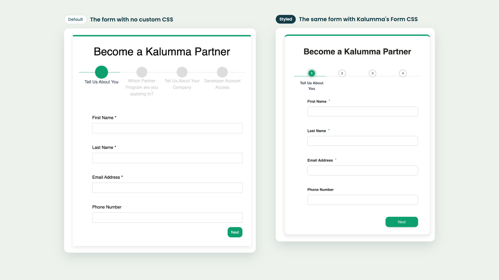
Give any form in Form Builder its own CSS, so applying to your partner program feels like part of your website. A form's CSS applies everywhere the form appears: on its hosted form page and on your own website when the form is embedded.
Add CSS to a form
- Go to Portal → Form Builder and open the form.
- Expand Custom styling. It appears once the form has been saved at least once.
- Enter your CSS in Form CSS (applies to this form everywhere — embedded and in-app).
- Save the form.
Your CSS is checked when you save. If it has a syntax error, or a selector reaches outside the form, the form won't save and the message starts with "Custom css could not be compiled".
Write selectors as if you're inside the form
Partner Fleet wraps your CSS so it only affects this form, and never the rest of your page. Write each selector as if you're already inside the form.
/* Correct */
.fdb-box { border-radius: 16px; }

/* Matches nothing: the wrapper is added for you, so this is applied twice */
.partner-application-form .fdb-box { border-radius: 16px; }
A selector that includes .partner-application-form saves without an error but has no effect. If a rule seems to do nothing, check for this first.
Classes you can style
The Themeable classes list above the CSS box shows the main parts of a form. Click a class to add an empty rule for it at the end of your CSS, with your cursor inside, ready to type.
| Class | What it styles |
|---|---|
.fdb-box | The card that holds the form |
.form-control | Text boxes and other inputs |
label | Question labels |
.required | The asterisk on required questions |
.f1-step | Each step in the step tracker at the top of multi-step forms |
.btn-primary | The main buttons, such as Next and Submit |
.f1-buttons | The row that holds the step buttons |
Forms with a single step don't show a step tracker.
An example
.fdb-box {
  border-radius: 14px;
  border-top: 6px solid #1f9d6b;
  box-shadow: 0 10px 30px -14px rgba(0, 0, 0, 0.15);
}
.form-control {
  border-radius: 8px;
}
label {
  font-weight: 600;
}
.btn-primary {
  border-radius: 10px;
}
Your brand color wins on buttons and the step trackerYour marketplace's primary color is applied to
.btn-primary, the active step and the step progress line with high priority. To give them a different color in your form CSS, add!importantto the rule, for example.btn-primary { background-color: #1f9d6b !important; }.
What form CSS can't reach
A few things sit outside the form, so form CSS doesn't style them:
- The thank-you page shown after someone submits the form.
- The open list of a dropdown question. Form CSS styles the closed dropdown, but the list of options opens outside the form.
- The rest of the page around a hosted form, such as its header and footer.
To style these, use the Custom CSS field in your marketplace's Advanced settings instead. That CSS applies to every page of your marketplace, so write selectors that target only what you mean to change.
Related
Updated 4 days ago