

Appearance
Learn how to configure branding, layout, filters, categories, languages, pagination, and advanced display settings for the In-App Marketplace.
In-App Marketplace setup
What this tab does
The Appearance tab controls how your In-App Marketplace looks. Branding, layout, filter and category options, sort behavior, languages, and pagination are all configured here. As you make changes, the layout preview on the right updates so you can see the structural effect of your choices.
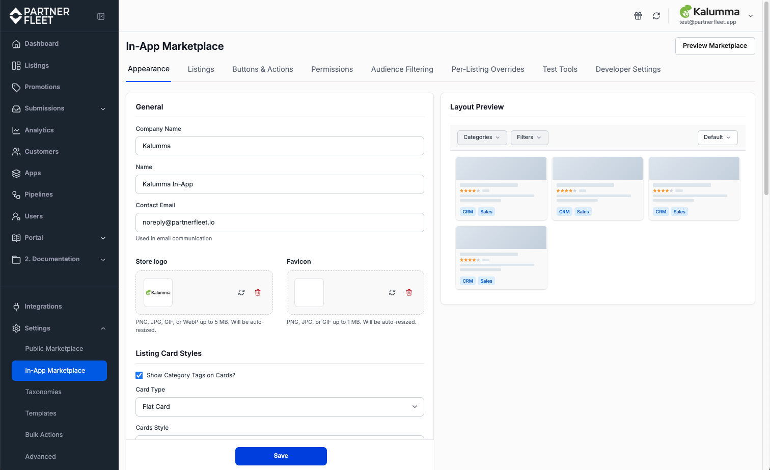
General
Company Name
The display name that appears in marketplace headers and email communication. This is typically the same as your company name in Partner Fleet.
Name
An internal name used to identify this marketplace within Partner Fleet. End-users do not see this.
Contact Email
Used for any email communication generated by the marketplace, such as lead form submissions. This should be a monitored inbox at your company.
Logo and Favicon
Upload your company logo and favicon. The logo appears in the marketplace header. The favicon appears in browser tabs when users navigate to listing detail pages.
Listing Card Styles
Controls how individual listing cards look in the marketplace grid.
- Show Category Tags on Cards: displays category tags directly on each listing card. Useful when categorization is a primary way users browse.
- Card Type: choose between Flat Card, Bordered Card, or other available card styles. Flat Card is the most minimal.
- Cards Style: additional visual treatments like "With Shadow" for a subtle elevation effect.
Filter & Categories
This section controls which filter and category dimensions users can browse in the marketplace, and how the marketplace presents them.
Filters and Categories
Use the multi-select dropdowns to choose which custom field-based filters and category dimensions appear in the marketplace's left sidebar. Both are configured at the marketplace level — they apply to all users equally.
Audience Filtering vs. Filters:
The Filters configured on this tab are user-facing — end-users click them to narrow the listing grid. They are different from Audience Filtering, which is a backend control that determines which listings each audience can see. See the Audience Filtering article for details.
Display options
- Filters and Categories expanded by default: if you check this option, all filter and category groups expand when the page loads. Useful for short lists; can be visually overwhelming for long ones.
- Show count on side of Filters and Categories: displays the number of matching listings next to each filter option.
- Show Filter Badges: displays the active filters as removable chips at the top of the listing grid.
- Filter type: choose between Checkbox or other selection patterns. Checkbox is the standard.
- Filter position: Left or Right sidebar.
Sort options
Choose which sort options are available to users via the Available sort options dropdown, such as Default, A-Z, Z-A, and Newest First, and which one is selected by default via Default sort option.
Error and No Results images
Upload images that display when the marketplace returns no results from a search/filter combination, or when an error occurs. These are optional but recommended for a polished experience. Recommended formats: PNG, JPG, or GIF up to 10MB.
Marketplace Internationalization
Choose which languages are available to marketplace visitors. When more than one language is enabled, a language selector appears in the marketplace, and users can switch between translated views of the content.
Regenerate AI Translations
When checked, saving the Appearance tab will regenerate AI-generated translations for all enabled languages using your current English content. This applies to headers, banners, footer, scripts, and SEO metadata. Use this when you've updated your English content and want translations to reflect the latest copy.
Translations note
AI-generated translations are a starting point. For high-stakes content, have a human translator review the output before relying on it. Translation quality varies by language.
Advanced
The Advanced section, collapsed by default, contains additional configuration options including custom CSS, header and footer scripts, and SEO metadata. These are typically managed by developers and require care — invalid CSS or scripts can break the marketplace UI.
Saving changes
Click Save at the bottom of the page to apply your changes. Most appearance changes take effect immediately. Layout and structural changes, such as switching pagination type, may require a page reload to see in the live marketplace.
Updated 4 months ago