

Settings
Marketplace Style & Layout Options
This guide walks through the Appearance settings available for your Public or Enablement Marketplace, based on the latest Marketplace configuration UI. These settings give you control over branding, layout, filters, SEO, localization, and advanced customization—so your marketplace feels like a natural extension of your product experience.
Many of these same styling and layout options are also available for your In-App Marketplace, allowing you to create a consistent experience for users whether they’re browsing publicly or directly inside your product.
Accessing Style & Layout Settings
You can configure style and layout settings separately for your Public Marketplace and your In-App Marketplace.
Public Marketplace
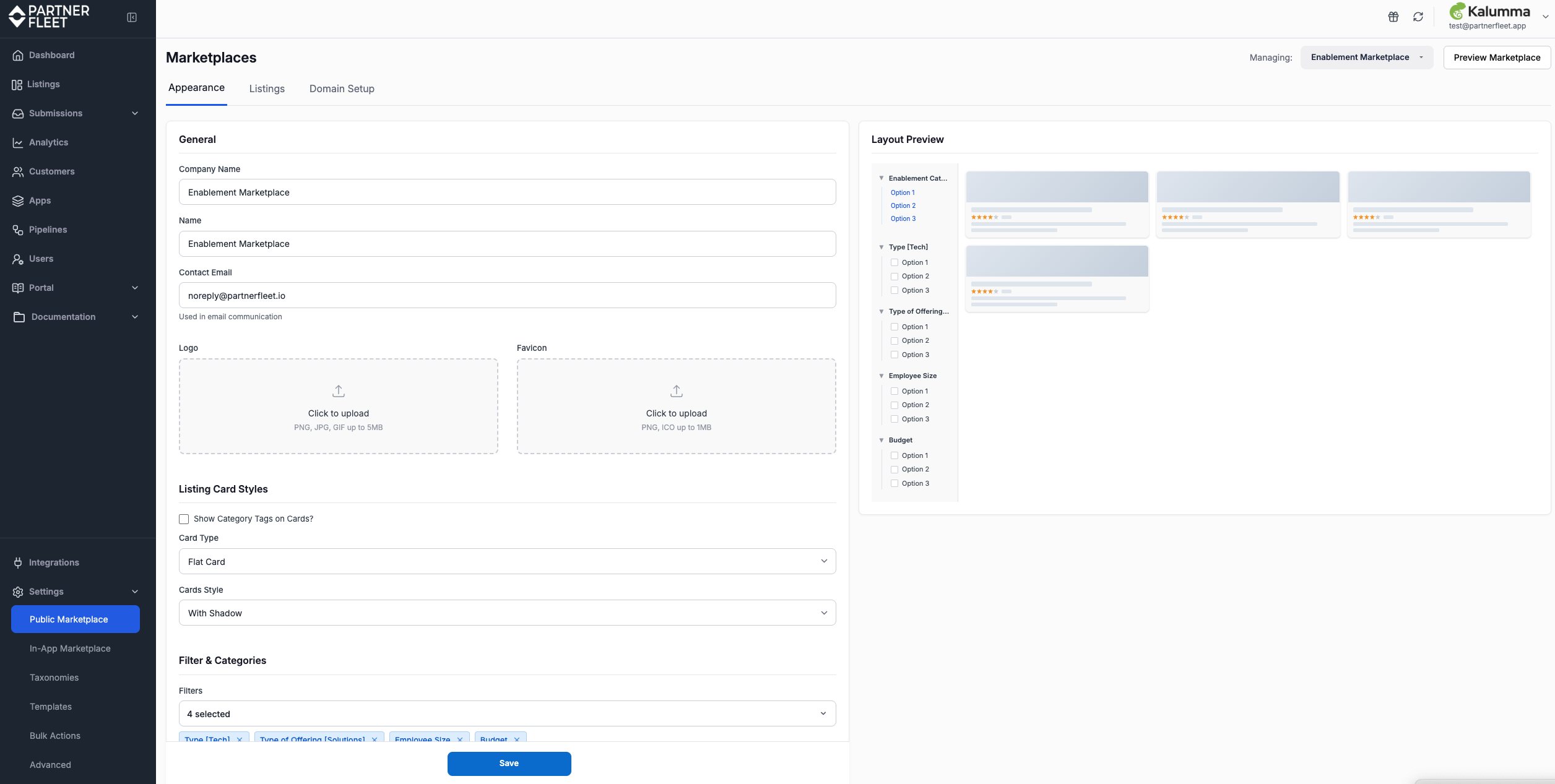
Navigate to: Settings → Public Marketplace → Appearance
From here, you’ll control how your public-facing marketplace looks, behaves, and appears to external visitors.
Settings → Public Marketplace → Appearance
In-App Marketplace
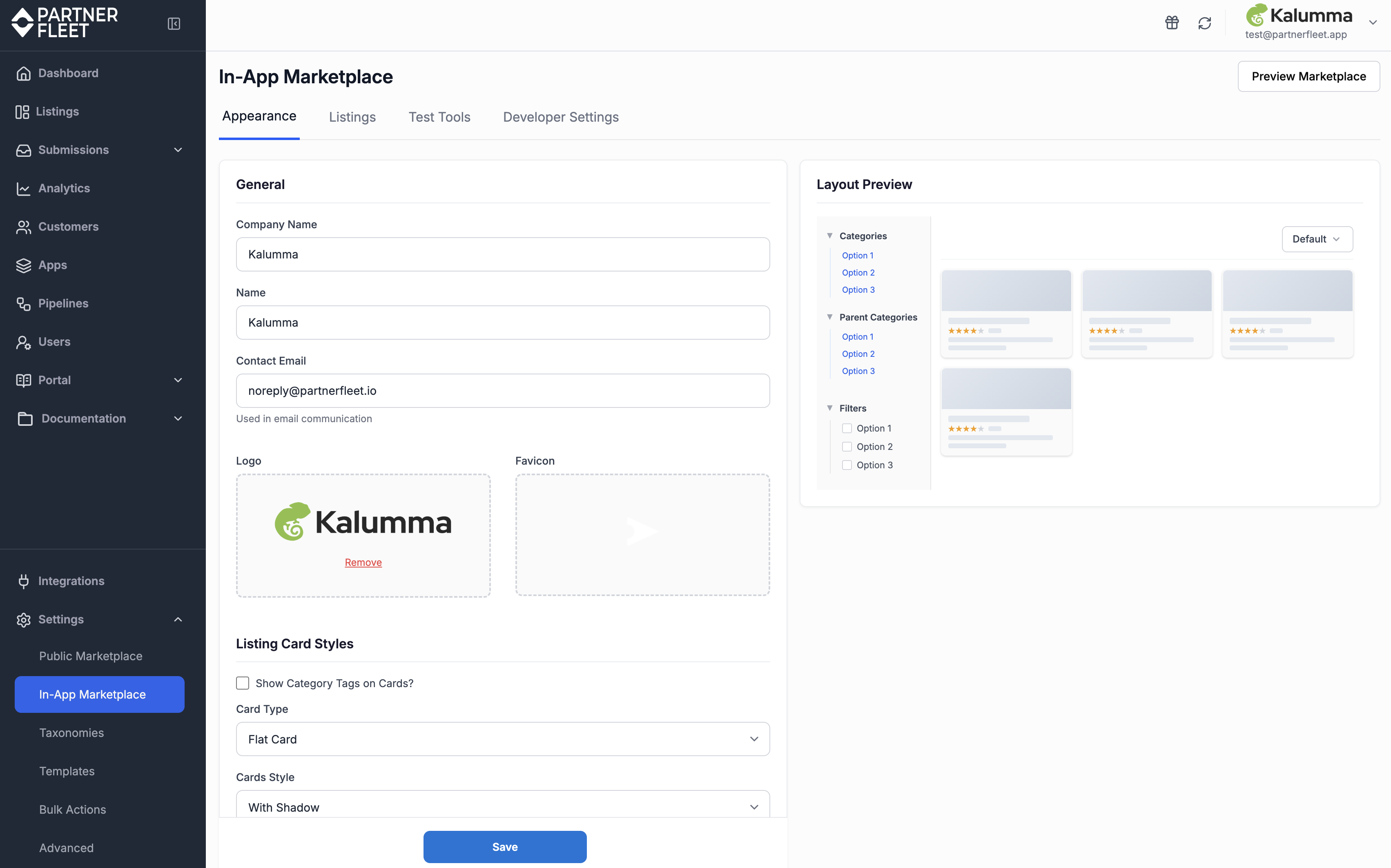
Navigate to: Settings → In-App Marketplace → Appearance
These settings allow you to apply many of the same branding and layout principles to the marketplace embedded inside your application, ensuring a cohesive end-to-end user experience.
Settings → In-App Marketplace → Appearance
Actions - Advanced vs. Edit.
On the right-hand side, you will find two clickable links: Advanced and Edit. Both links open pop-up modals where you can make updates to your Marketplace
Advanced Settings:
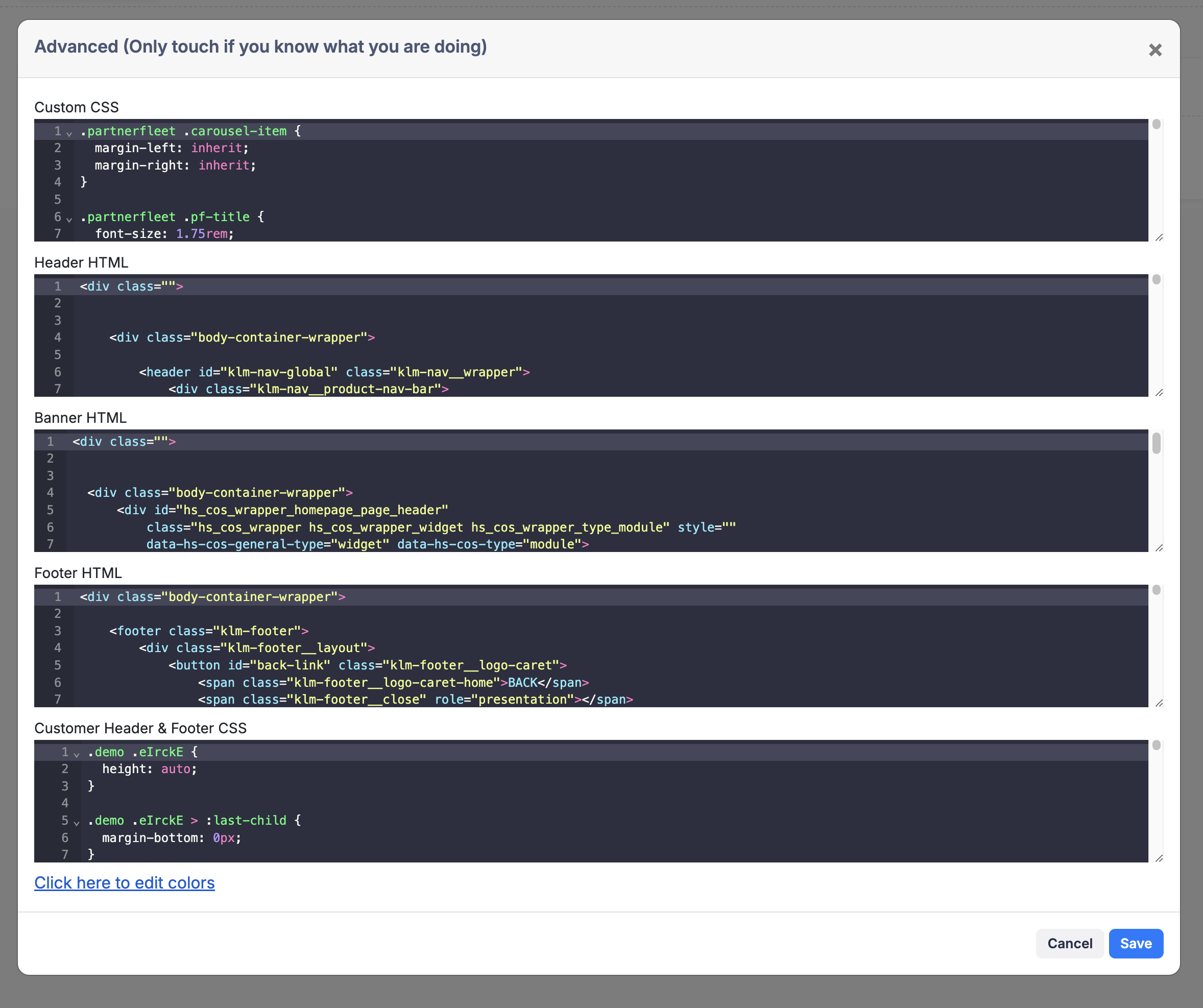
Advanced provides access to more in-depth and complex customization settings. Use the Advanced modal to fine-tune the underlying settings, code snippets, add custom CSS and HTML. This section does require a deeper level of configuration and expertise.
We will help you manage this through onboarding and customer success. This section is used to define a custom header and footer to match you core website.
See Screenshot
Edit Settings:
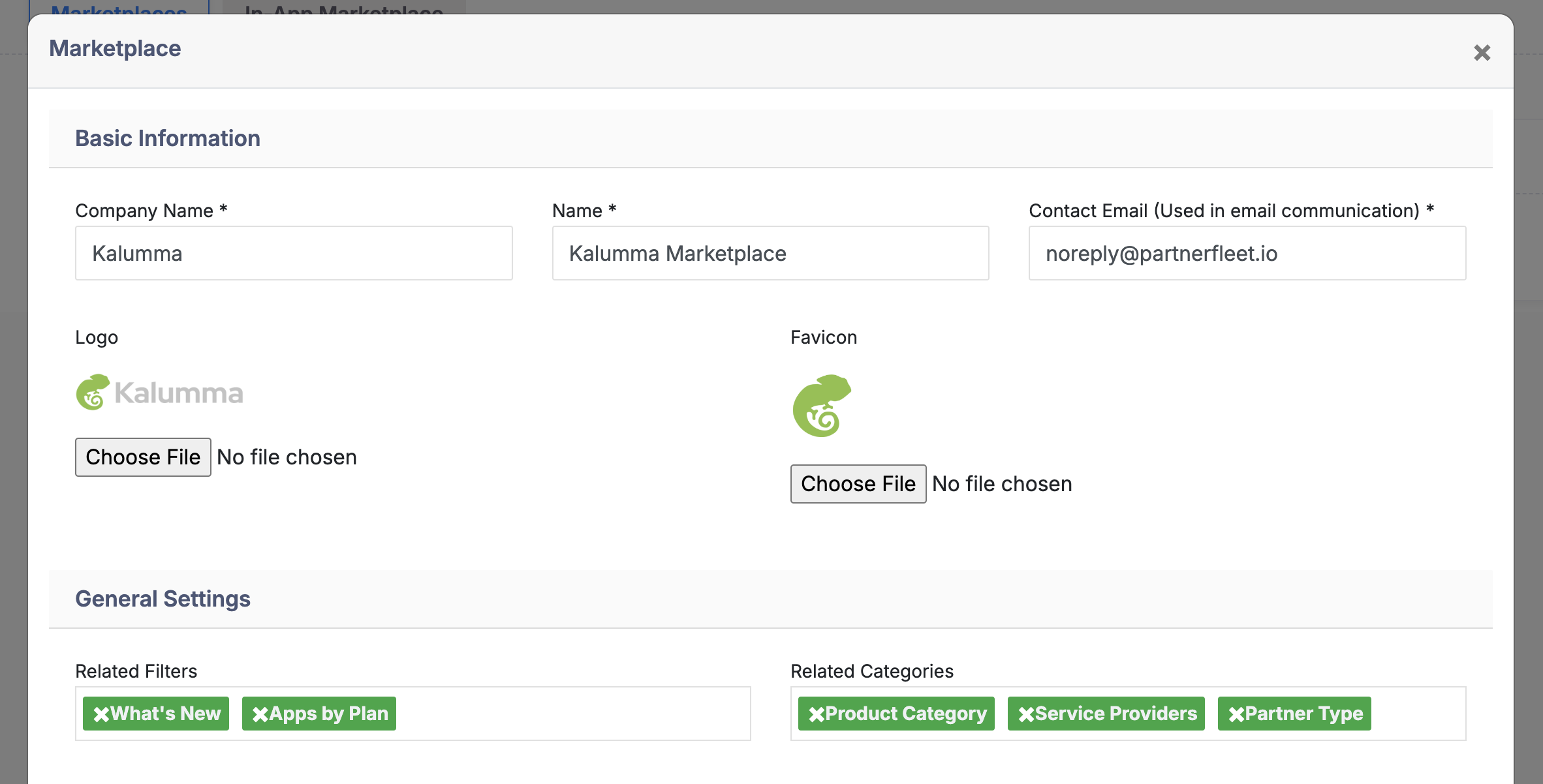
The Edit modal offers an intuitive interface for quick customization, letting you modify marketplace basics—like text, images, and layouts—without technical skills. This allows for easy customization and upkeep, ensuring your Marketplace stays up-to-date with minimal effort.
It includes a few key sections:
Basic Information:
Update foundational details, such as company and marketplace names, and designate a contact email for direct marketplace communications, like email invites. This section also allows you to customize the admin logo and favicon, enhancing brand visibility across your marketplace.
General Settings:
Add your marketplace filters and categories here, allowing users to navigate more effectively.
See Screenshot
Default design styles for your marketplace: In this section you can decide it you'd like to show category tags on cards, select from four pre-designed options, offering flexibility in how partner information is presented visually across the marketplace. Each layout optimizes partner visibility and engagement based on different design and functionality needs, allowing you to customize the user experience effectively.
Default card types
See Options
Cards
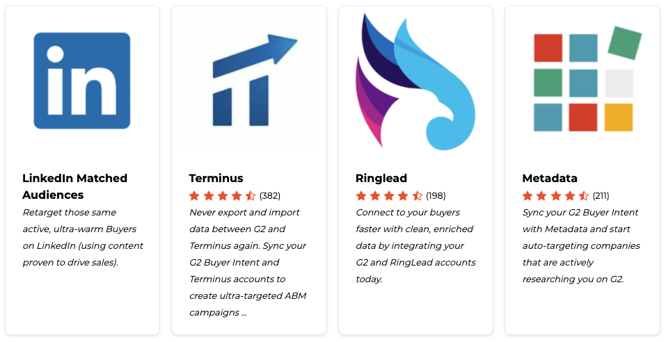
Small Cards
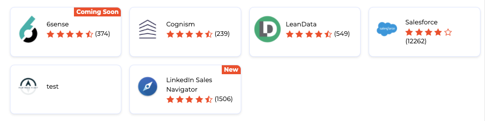
List
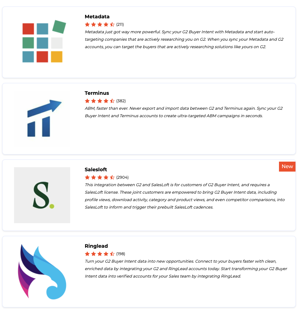
Flat Cards
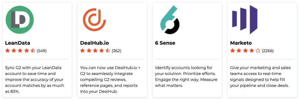
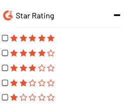
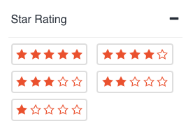
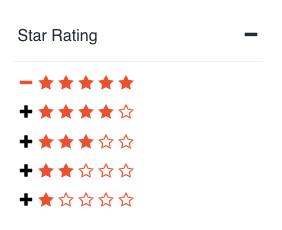
Filter Type and Position:
Customizes how filters appear in your marketplace. You can select the display style, specify the filter location on the page, and choose whether filters are expanded by default. This flexibility allows for a tailored user navigation experience, enhancing ease of access to key marketplace categories.
See Options
Checkbox
Pills
Links
Sorting Options:
Allows you to define which sorting methods are available to users and set your preferred default sorting option. You can control how sorting displays on the marketplace homepage, ensuring users see content prioritized in a way that aligns with your objectives and enhances their browsing experience.

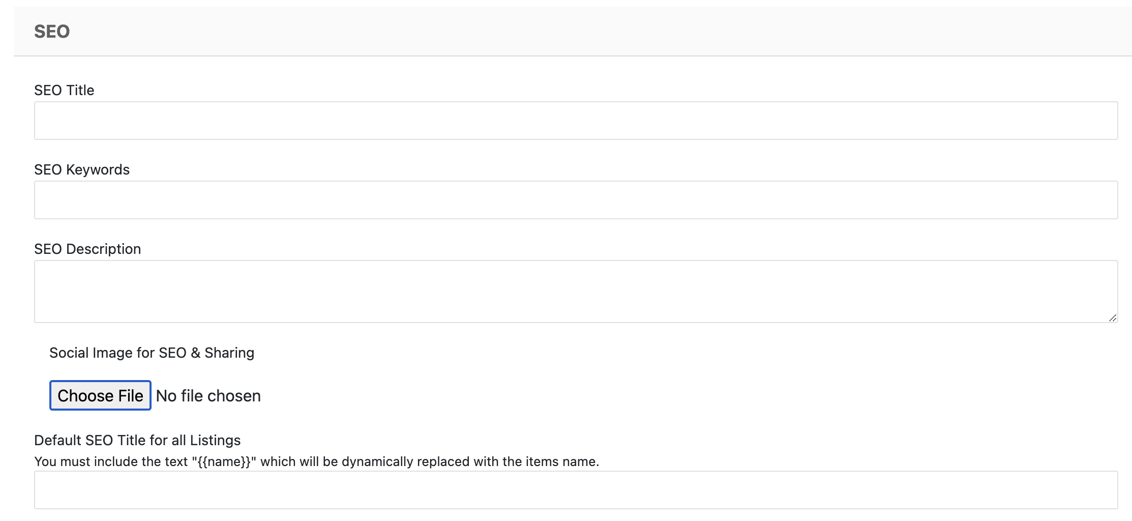
SEO:
Add additional Marketplace SEO content, including a default image for social sharing.
Learn more about system SEO capabilities here.
Legal:
Include links to your privacy policy and terms of service.

Updated 8 months ago